
Sony's global marketing website reimagined with immersive experiences and modular design.
Problem/Goal:
Sony's Global Design Framework consolidated regional web properties in 110 countries and 30 languages into a single platform with a globally shared backend, CMS, and responsive design system.
Inspired by Sony's innovative past, this project aimed to carry Sony into the future with a modern and unified user experience across the globe while also providing important efficiency benefits to the business.
Ideation:
Module Based Development
A flexible system of modules that could easily be rearranged and customized per page. Our system consisted of a carefully designed library of interaction patterns and content layouts that could seamlessly stack and rearrange on a page.

Global Design
Design direction for Sony meant appealing to the cultures and needs of the entire globe. Our web product served 110 different countries and was translated into 30 languages. We strove for universal appeal with design, experience, and content while customizing per locale as required.
Sony's website is considered one of the largest responsive design efforts undertaken in the digital space today.
Deliverables:
As a Front End Developer on Sony's global web transformation project, I added features via HTML5/CSS3/JS development, provided platform support, fixed bugs, and assisted UX and design teams in planning upcoming feature enhancements.
I was responsible for gathering requirements from the creative team to estimate and analyze development specifications, while working in an agile scrum process.
During this project, I had the opportunity to collaborate with colleagues from around the globe in an agile environment, with weekly sprints, daily scrums, Jira tracking, and retrospectives.
I hand-coded custom modules, added global features, managed the codebase, and debugged the site across multiple locales using Jade, Node, JS, HTML, CSS, and JSON.
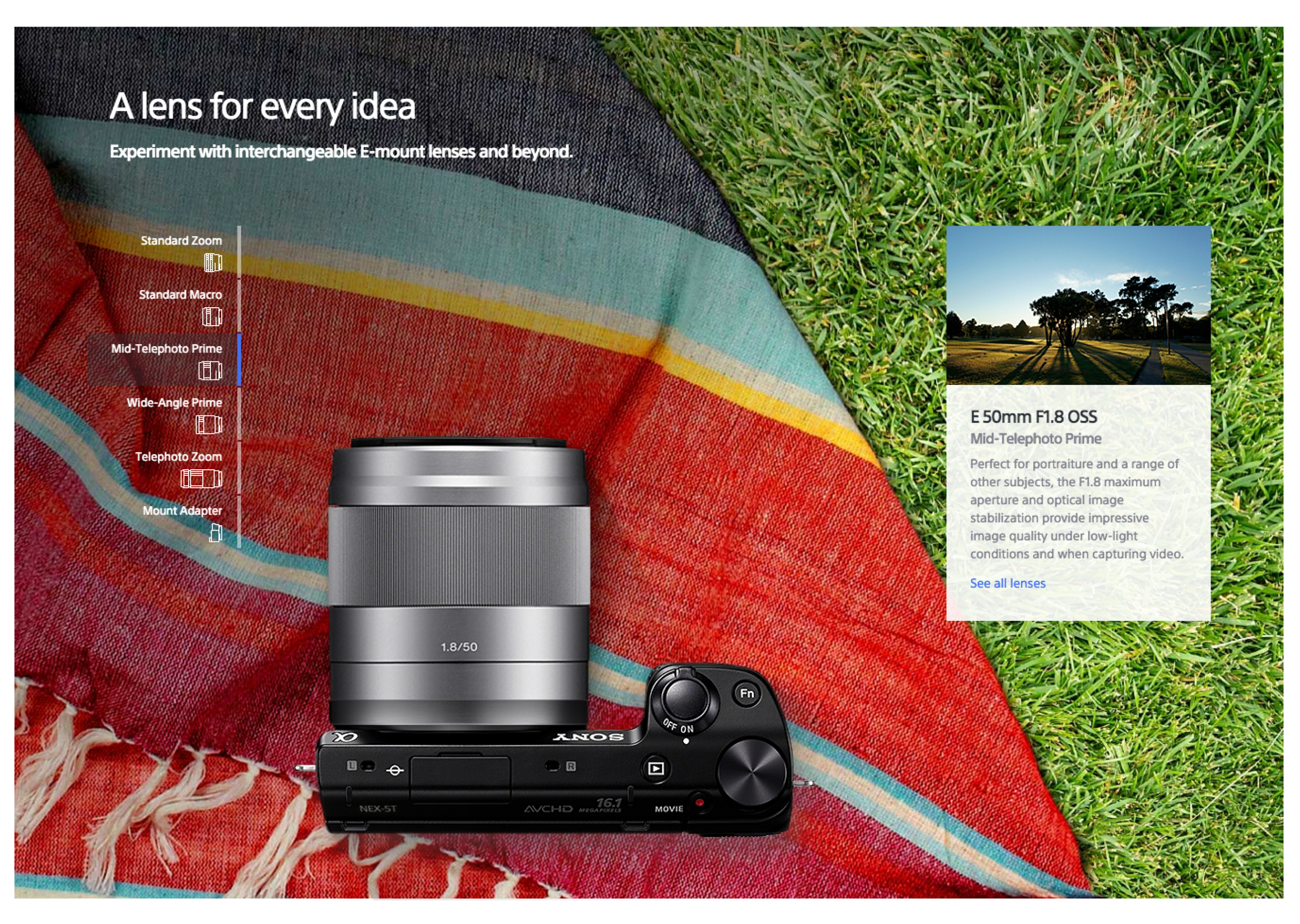
Sony Website's Various Design System Interaction Modules
Sony Design System Components
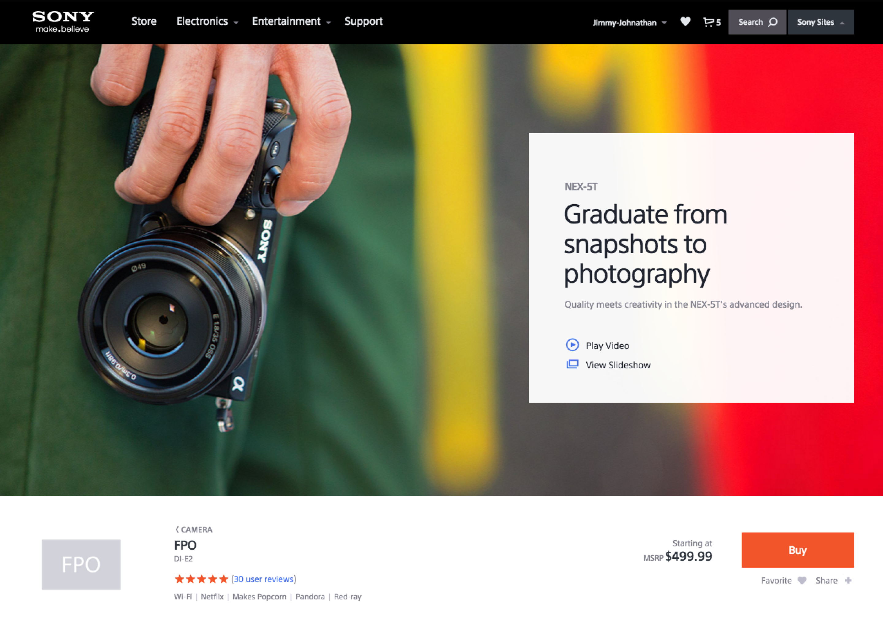
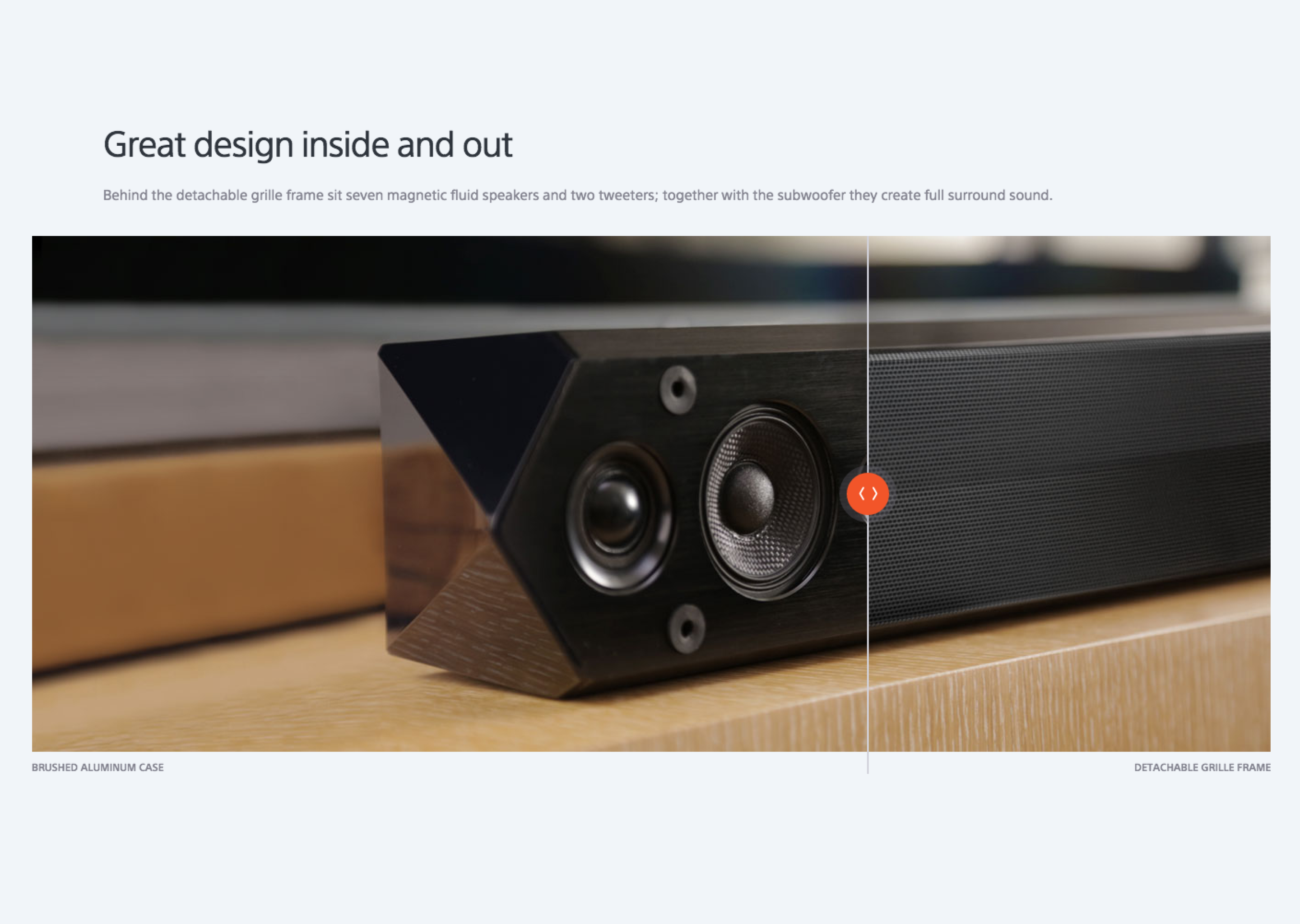
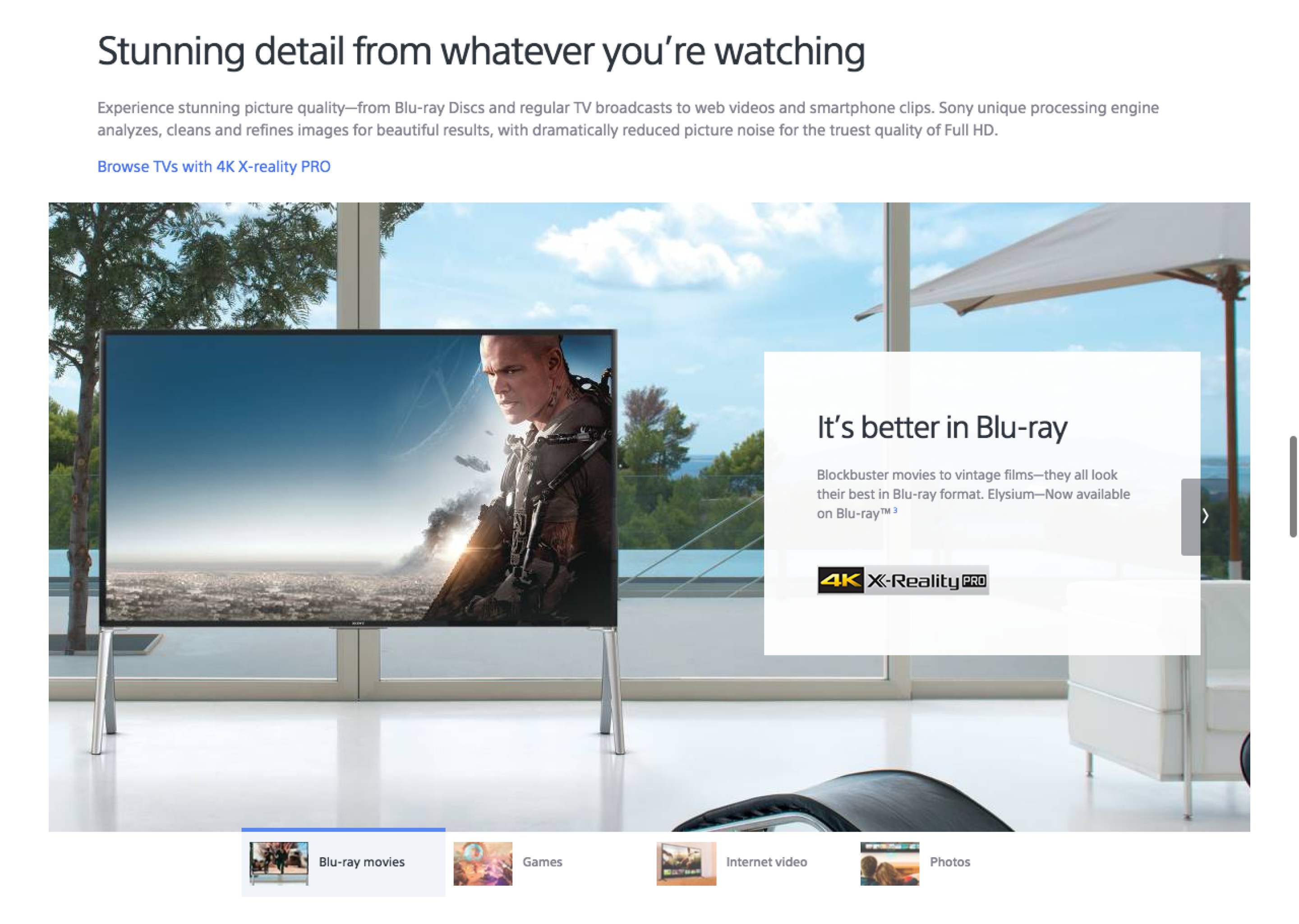
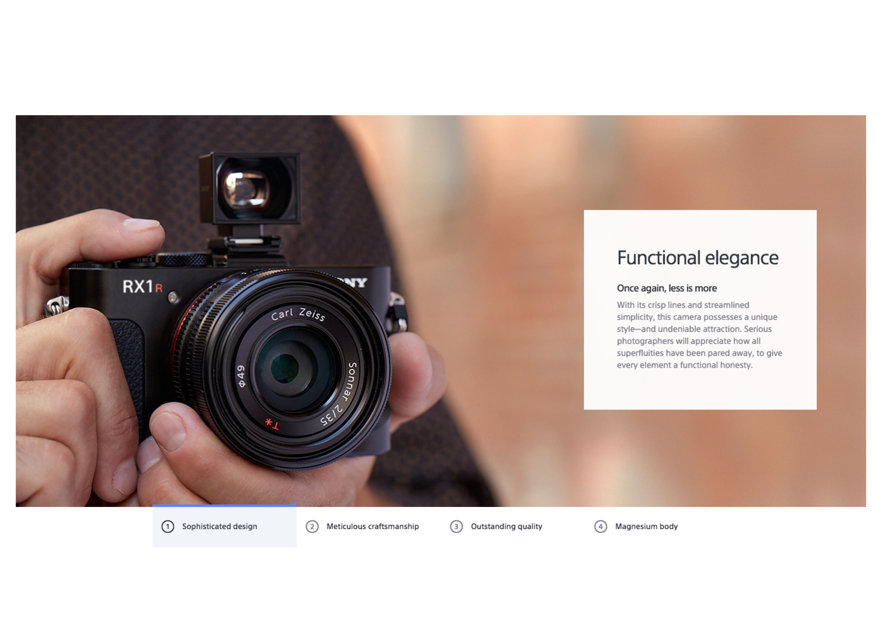
Responsive Design
One key aspect of the Sony design system was to support multi-screen browsing experiences. The challenge was strategically designing system-level flexibility into components and modules that could react to various devices and screen sizes. Supporting a viewing experience on touch devices was just as important as on desktop.
I integrated responsive web design techniques and modern web technologies – HTML5, CSS3, Require.js, Grunt, and Vagrant to create engaging and highly visible product and marketing web pages as part of a completely new web platform for Sony.
Site Navigation with Filter

